スマホアプリの個人開発で忙しいため、ブログを書く時間がなく、DIYネタばかり溜まっていっています。
プログラミングの備忘録はChatGPTの台頭により、需要が薄れてきたと感じたのでやめていましたが、ChatGPTもまだまだ完璧ではありません。そんな時は検索が有効な手段です。同じ悩みを持つ方に届けば良いなと思い、この記事を書きます。
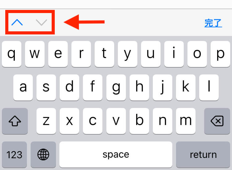
キーボードの矢印とは何かというと、これです。
私の調べた限りでは、ReactNativeにはこれを表示させる機能がなかったです。(あったら教えてください)
HTMLにはtabindexと呼ばれるものがあり、普通に実装できます。
TextInputGroupみたいなのあったらいいのにと調べたら…あるんですが、思っているのと違います。
https://github.com/v0idzz/react-native-text-input-group
更に調べていたら、InputAccessoryViewコンポーネントという、キーボードの上部をカスタマイズできるコンポーネントに出会いました。
これを使うしかないでしょう。
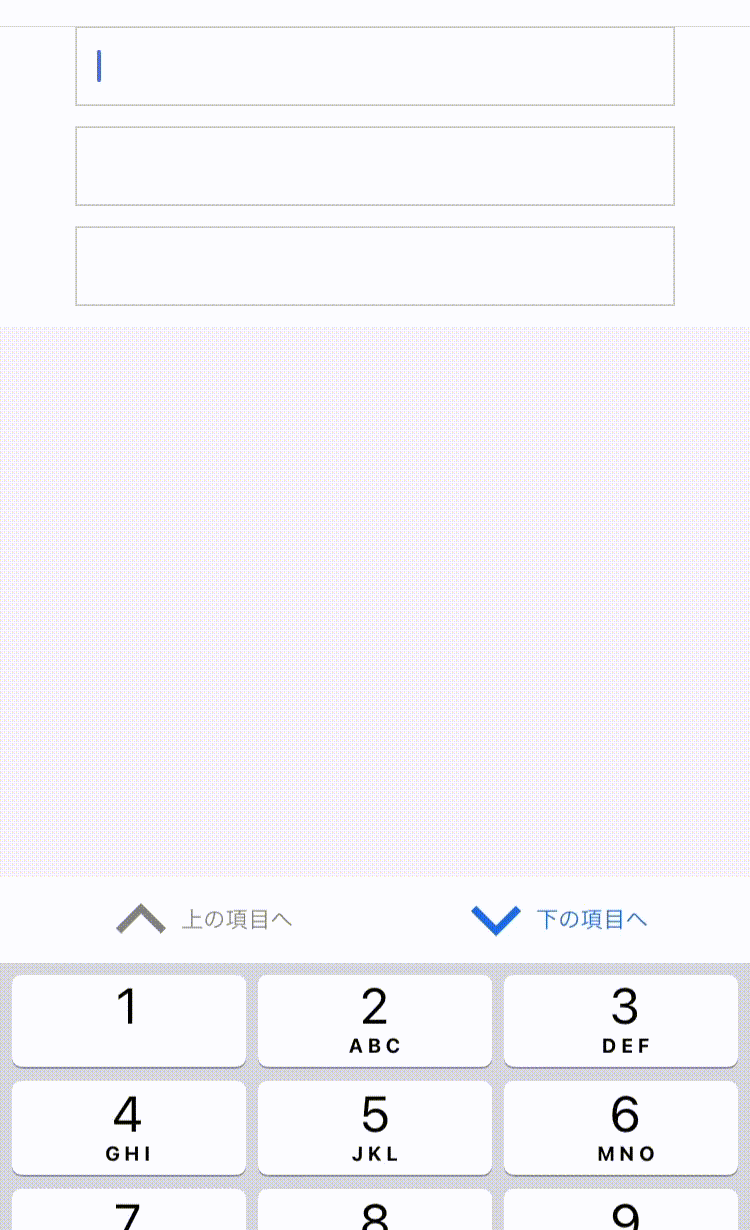
完成モックアップ
コード
import React, { useState, useRef } from 'react';
import { View, TextInput, InputAccessoryView, StyleSheet } from 'react-native';
import Icon from 'react-native-vector-icons/MaterialIcons';

const CustomInput = () => {
  const [focusedInputIndex, setFocusedInputIndex] = useState(0);
  const inputRefs = useRef([]);

  const toggleFocus = (direction) => {
    let nextIndex;

    if (direction === 'up') {
      nextIndex = focusedInputIndex > 0 ? focusedInputIndex - 1 : inputRefs.current.length - 1;
    } else if (direction === 'down') {
      nextIndex = focusedInputIndex < inputRefs.current.length - 1 ? focusedInputIndex + 1 : 0;
    }

    setFocusedInputIndex(nextIndex);
    inputRefs.current[nextIndex].focus();
  };

  const inputAccessoryViewID = 'uniqueID';

  const renderInputAccessoryView = () => (
    <InputAccessoryView nativeID={inputAccessoryViewID} backgroundColor="#f2f2f2">
      <View style={styles.accessoryContainer}>
      <Icon
          name="keyboard-arrow-up"
          size={40}
          onPress={() => toggleFocus('up')}
          color={focusedInputIndex === 0 ? 'gray' : '#156AE5'}
          disabled={focusedInputIndex === 0}
        />
        <Icon
          name="keyboard-arrow-down"
          size={40}
          onPress={() => toggleFocus('down')}
          color={focusedInputIndex === inputRefs.current.length - 1 ? 'gray' : '#156AE5'}
          disabled={focusedInputIndex === inputRefs.current.length - 1}
        />
      </View>
    </InputAccessoryView>
  );

  return (
    <View style={styles.container}>
      <TextInput
        style={styles.input}
        keyboardType="numeric"
        onFocus={() => setFocusedInputIndex(0)}
        inputAccessoryViewID={inputAccessoryViewID}
        ref={(ref) => (inputRefs.current[0] = ref)}
      />
      <TextInput
        style={styles.input}
        keyboardType="numeric"
        onFocus={() => setFocusedInputIndex(1)}
        inputAccessoryViewID={inputAccessoryViewID}
        ref={(ref) => (inputRefs.current[1] = ref)}
      />
      <TextInput
        style={styles.input}
        keyboardType="numeric"
        onFocus={() => setFocusedInputIndex(2)}
        inputAccessoryViewID={inputAccessoryViewID}
        ref={(ref) => (inputRefs.current[2] = ref)}
      />
      {renderInputAccessoryView()}
    </View>
  );
};

const styles = StyleSheet.create({
  container: {
    flex: 1,
    justifyContent: 'center',
    alignItems: 'center',
    backgroundColor: '#ffffff',
  },
  input: {
    width: '80%',
    height: 40,
    borderWidth: 1,
    borderColor: '#ccc',
    paddingHorizontal: 10,
    marginBottom: 10,
  },
  accessoryContainer: {
    flexDirection: 'row',
    paddingHorizontal: 10,
  },
});

export default CustomInput;アイコンはnpm install --save react-native-vector-iconsにてインストールし、https://oblador.github.io/react-native-vector-icons/から選んでくると良いと思います。
<InputAccessoryView>内でキーボード上部のカスタムビューを設定しています。upやdownが押された時に、フォーカスを変える処理をしています。矢印だけでなく、「完了」ボタンを追加したり様々なカスタマイズができそうです。
注意
こちらのコードは私のiOS端末のみで確認をしています。リファレンスを見ても、
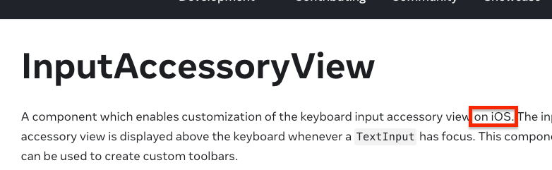
となっており、iOSでしか動作しない事がわかります。
AndroidではInputMethodServiceを使うとできそうですが、こちらは追って報告します。
https://developer.android.com/reference/android/inputmethodservice/InputMethodService
追記 6.11
ユーザビリティ向上のため、カスタマイズをしてみました。
import React, { useState, useRef } from "react";
import {
  View,
  TextInput,
  InputAccessoryView,
  StyleSheet,
  ScrollView,
  TouchableOpacity,
  Text,
} from "react-native";
import Icon from "react-native-vector-icons/Ionicons";

const CustomInput = () => {
  const [focusedInputIndex, setFocusedInputIndex] = useState(0);
  const inputRefs = useRef([]);

  const toggleFocus = (direction) => {
    let nextIndex;

    if (direction === "up") {
      nextIndex =
        focusedInputIndex > 0
          ? focusedInputIndex - 1
          : inputRefs.current.length - 1;
    } else if (direction === "down") {
      nextIndex =
        focusedInputIndex < inputRefs.current.length - 1
          ? focusedInputIndex + 1
          : 0;
    }

    setFocusedInputIndex(nextIndex);
    inputRefs.current[nextIndex].focus();
  };

  const inputAccessoryViewID = "uniqueID";

  const renderInputAccessoryView = () => (
    <InputAccessoryView
      nativeID={inputAccessoryViewID}
      backgroundColor="#f2f2f2"
    >
      <View style={styles.accessoryContainer}>
        <TouchableOpacity
          onPress={() => toggleFocus("up")}
          disabled={focusedInputIndex === 0}
          style={styles.touchable}
        >
          <Icon
            name="ios-chevron-up"
            size={40}
            color={focusedInputIndex === 0 ? "gray" : "#156AE5"}
          />
          <Text style={{ color: focusedInputIndex === 0 ? "gray" : "#156AE5" }}>
            上の項目へ
          </Text>
        </TouchableOpacity>
        <TouchableOpacity
          onPress={() => toggleFocus("down")}
          disabled={focusedInputIndex === inputRefs.current.length - 1}
          style={styles.touchable}
        >
          <Icon
            name="ios-chevron-down"
            size={40}
            color={
              focusedInputIndex === inputRefs.current.length - 1
                ? "gray"
                : "#156AE5"
            }
          />
          <Text
            style={{
              color:
                focusedInputIndex === inputRefs.current.length - 1
                  ? "gray"
                  : "#156AE5",
            }}
          >
            下の項目へ
          </Text>
        </TouchableOpacity>
      </View>
    </InputAccessoryView>
  );

  return (
    <ScrollView keyboardShouldPersistTaps="handled">
      <View style={styles.container}>
        <TextInput
          style={styles.input}
          keyboardType="numeric"
          onFocus={() => setFocusedInputIndex(0)}
          inputAccessoryViewID={inputAccessoryViewID}
          ref={(ref) => (inputRefs.current[0] = ref)}
        />
        <TextInput
          style={styles.input}
          keyboardType="numeric"
          onFocus={() => setFocusedInputIndex(1)}
          inputAccessoryViewID={inputAccessoryViewID}
          ref={(ref) => (inputRefs.current[1] = ref)}
        />
        <TextInput
          style={styles.input}
          keyboardType="numeric"
          onFocus={() => setFocusedInputIndex(2)}
          inputAccessoryViewID={inputAccessoryViewID}
          ref={(ref) => (inputRefs.current[2] = ref)}
        />
        {renderInputAccessoryView()}
      </View>
    </ScrollView>
  );
};

const styles = StyleSheet.create({
  container: {
    flex: 1,
    justifyContent: "center",
    alignItems: "center",
    backgroundColor: "#ffffff",
  },
  input: {
    width: "80%",
    height: 40,
    borderWidth: 1,
    borderColor: "#ccc",
    paddingHorizontal: 10,
    marginBottom: 10,
  },
  accessoryContainer: {
    flexDirection: "row",
    paddingHorizontal: 10,
    justifyContent: "space-around",
    backgroundColor: "white",
  },
  touchable: {
    flexDirection: "row",
    justifyContent: "center",
    alignItems: "center",
  },
});

export default CustomInput;
カスタマイズは無限ですね。